
6 Essential Creatives To Run In Your Meta Account
Creative is the absolute biggest performance lever in paid social. It is what gets our foot in the door to connect…

Creative is the absolute biggest performance lever in paid social. It is what gets our foot in the door to connect with our target audience and lead them to purchase, so it has to be one of your top priorities for your paid social strategy. Even the best structured account will underperform if your creative isn’t great.
If you’re new to the creative side or your brand has just started in paid social advertising, it can be overwhelming to define the best creative course to start with. If you’re reading this, you’ve come to the right place.
I’m going to give you a quick guide of ad frameworks that you can start testing with your account.
First we need to understand what ad frameworks are. They are a set of rules and styles you can follow to get a certain style of creative. There are a lot of them, but these are the ones we recommend you to test first.
Us vs. Them
It’s a direct comparison ad where you show your strong points vs the competitor’s weaknesses. It gives you the opportunity to show your potential customer why your product is better and why they should buy from you instead of the competition.
Here are a few tips on how to execute this type of ad:
- You should always address your customer’s pain point in your statements.
- Use a split screen style to position the products side by side [I’d advise you to have the competitor on the left and your product on the right side, so that you can go from the Problem to the Solution]
- Keep your statements short and direct.
- The use of emojis makes it look more organic and native to the platform, it can also help enhance the sentiment of your statement [i.e. Great taste! 🤤 vs Tastes like dirt 🤮]
- Adding social proof is a great way to emphasize that your product is superior; people are more likely to buy something that is backed up by real people. ‘If 1000+ are saying it’s great it must be true’
This ad framework is a must have in your ad accounts, I highly recommend giving it a try!
Here’s an example:
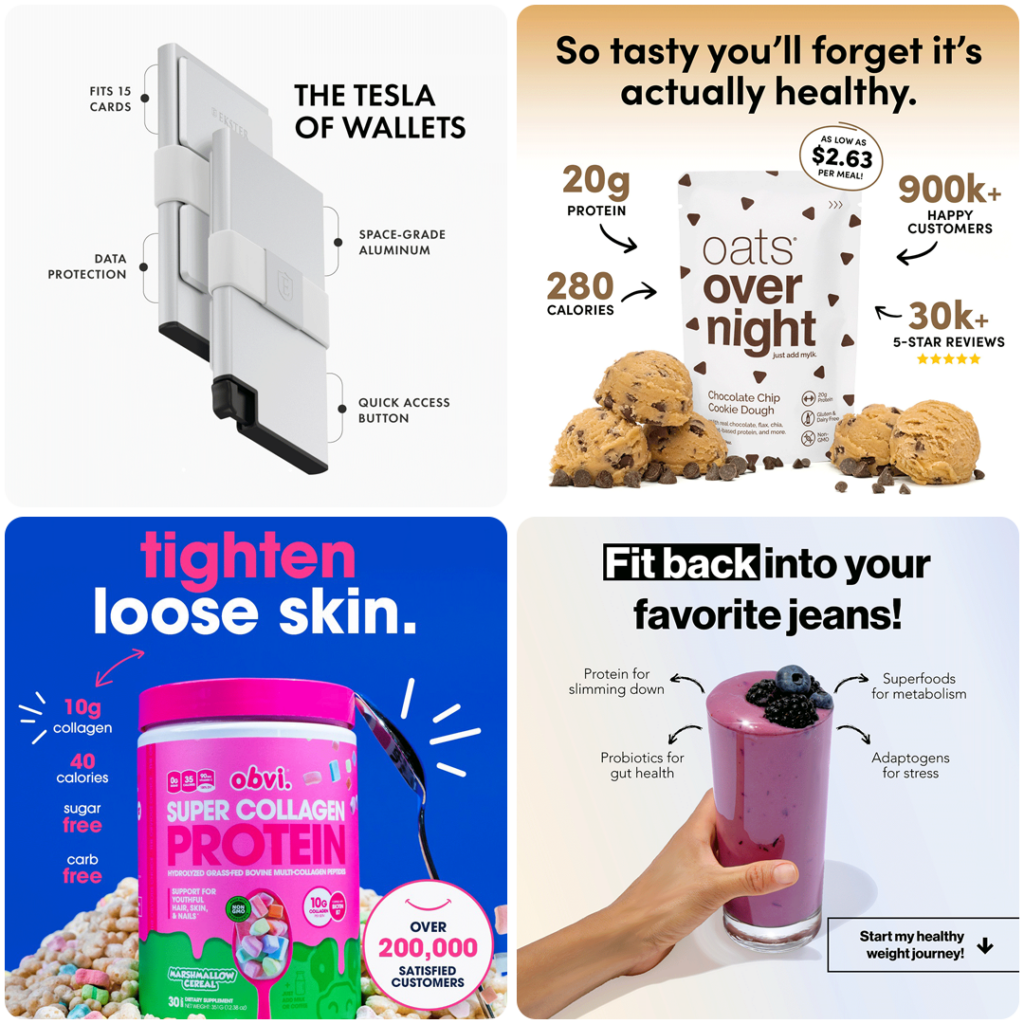
Feature Callout
The Feature/Benefit Callout Ad is a great option for all industries and super easy to test, doesn’t require many assets to create, and you can use product photography or even a UGC shot.
The goal of this ad framework is to point out the best features of the product on display. You can use pointers, lines, arrows, or even TikTok style text for a more organic look. Point these to the specific area the feature is located or the benefit that you want to highlight, and you can also point out the ingredients in your product to let the viewer know what it’s made from.
A few tips when designing this type of ad:
- Mine your reviews – it will help you identify which benefits your customers like the most or even discover an unexpected benefit from your product. It will also help you understand how they speak so that you can align your messaging to their own words.
- Add an engaging headline or even a short review that highlights the benefits you get from the product.
- Keep it clean so the feature is the main focus in the design.
- Avoid using too many call outs so the design doesn’t look crowded.
Here are a few examples:
Before & After
This is a very strong way to show the results of using your product, and gives social proof that if it works for other people, then it can work for you. Use it to overcome objections to your product that are related to the effectiveness of their use, and it can also be used to show how your product is superior to the competitors showing the results in less time (if that’s the case).
When designing the creative use a split screen that shows both before and after so the customer can see the comparison from the beginning.
A few tips for you:
- You can add time of use [Day 1 / Day 30].
- A text callout with the problem the user had vs the improvements they experienced after using the product [Constantly breaking out / Clear Skin].
- Show both images side by side, or if you want to create a bit of mystery try blurring the after and adding a CTA like “Click to see results”.
Doing Before/After can be tricky in Facebook ads. Depending on the niche you’re in it can be a struggle to get them approved [especially if you’re in the weight loss niche], however there are ways to label the results so you can avoid getting your creatives rejected by the platform – see these examples below:
- How it started / How it’s going
- Without [Product Name] / With [Product Name]
- This is X today / This was X before
- Day 1 / Day X
This type of ad works great for: skincare, hair, and supplements, but it’s not limited to these niches. You can apply it to most products as long as you present a way to portray a clear difference between the before and after using the product.
Here are a few examples:

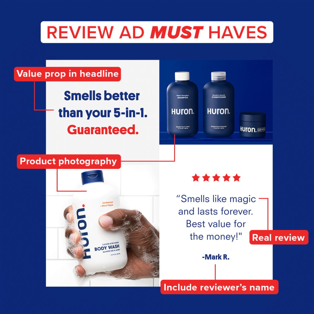
Reviews
Let’s remember that people will always trust you more if someone else (real people) can provide proof of what you’re claiming; this is where Reviews come in. They are the social proof from customers that have already used or tested the product and it will help to create a sense of security or trust in the brand because other people have used it and they can back up our claims about the benefits it provides.
The great thing about this framework is that it is universal, can work for any niche or product, since social proof is always a strong way to build credibility with your audience.
Here are a few tips on how you can implement this framework in your advertising:
- Use real reviews and include the reviewer’s name
- Always mine your reviews to find the most unique ones – try to look for a very catchy message or impression
- You can work your reviews around a specific problem your audience has and string them together. Ex: trouble sleeping and you pull 10 reviews together talking about how it helps with sleep.
- It can be done in a variety of formats: a static image of your product and the review overlayed on it, make a GIF with several reviews or a video showing your product and start adding reviews with animated text, screenshots from your website, or even VO.
- If you happen to have UGC video of several customers talking about their experience (AKA giving their review), then you can make a mashup with all of them and then end it with a cool video of your product and an end card with a call to action.
No matter if you have 5 or 1,000 reviews, you can always try this framework as one of your first tests in your ad account. Play around with text size, static or gif, screenshot or text overlay, etc…you have a variety of options so don’t feel limited if you’re a new brand without that much social proof.
Here’s an example:
Problem/Solution
As Theodore Levitt said, “Sell the hole, not the drill.”
People don’t want to buy products, they want to buy solutions to their problems. The basis for this framework is precisely about that: Do you have this problem? Here’s how [your product/service] solves it.
Start addressing the problem or pain point the customer has so they can relate, and then introduce the solution that your product provides and how.
There are a few key elements to develop this type of creative framework:
- Problem must be relatable.
- Introduce the problem in a clear, attractive way with strong visual hooks.
- Agitate the problem to increase the customer’s pain point.
- Use direct, strong messaging:
- Are you SUFFERING from X, Y, Z?
- Tired of X?
- Struggling with X?
- Sick of [problem]?
- Solution must be clear and presented in an easy way, so make sure you mention all the features that will guarantee the problem will be solved
- [Product] will make it a breeze!
- With [product] you can stop worrying about [problem]
- Text overlays are always a must to add emphasis.
As long as the problem is relatable to your audience this can work for any niche or product, the key is identifying the specific problems your product can fix. This framework works great with UGC content because it makes it easier to relate to the problem if a person is experiencing and explaining how the product solves their problem [same problem your customer is having].
Here’s an example:
UGC – User Generated Content
This is, as the name implies, videos or images that are made to look as if they were made by an actual user instead of an in-studio shot, so it has a more organic look and feel. This is delivered by content creators sourced by the brand or agency handling their ads, they’re given an angle or a script on which they will base their deliverables.
The most common format for these are TikTok style videos, and they have 3 main components:
- Hook: the first 3 seconds of the ad that are intended to stop the scroll from the consumer.
- This can present a problem/solution (i.e. Is your shampoo giving you greasy hair? I have the solution for you)
- An enticing phrase (i.e. 3 reasons why your hair is not growing; TikTok made me buy it, etc)
- It can be a video of something eye catching or satisfying (such as serum applied to face, liquid pouring, gooey textures)
- Body: this is your context on the hook. It will explain why this product is going to solve the consumer’s problem, explain the benefits, features, etc.
- CTA: your Call To Action, or the part of the ad where you invite your consumer to take an action, click here, buy, order yours, etc. It can be in the voice over of the video or it can be a text overlay.
Within the UGC framework there’s a great variety of angles or concepts that can be used, as long as they look organic and user generated. A few examples are Problem/Solution, Founders Story, How To, and Listicle just to list a few.
Here are 2 examples:
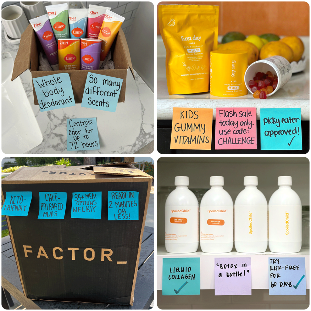
‘Ugly’ Ads
We owe the credit for this one to the great Barry Hott, he’s the pioneer in using “ugly ads’ and it’s proven that they work.
What is an ugly ad? It’s an ad that is not as polished and branded as content normally is. It’s not a perfectly curated photo of your product with strategically placed text or callouts. This is the easiest way to make an ad, and it works because it’s natural andit looks organic, so people feel more drawn to it because they don’t think we’re trying to sell them something.
The most famous treatment for this is the Post It Note ad where you write a benefit, feature, or offer, on a post it and just stick it to your product and take a picture with your phone. It doesn’t have to be perfect, it doesn’t have to be pretty, trust me, we’ve tried it and it has worked for every brand we did it for.
But it’s not just a post it: it can also be a candid video of someone using the product or explaining why it works, or maybe a photo uploaded in a review and then just stick a screenshot of the review on top of it. No color grading, no rule of thirds or smooth transitions, no polished and meticulously centered text, the uglier the better.
Here are a few examples:
These are the most universal ad frameworks, in my opinion, that can fit in almost any niche or industry. We have tested them and they have worked for us. It’s going to make your ideation process easier because it’s easier to structure a brief if you have a specific set of guidelines to follow. This also makes the creative testing process easier because you can choose a concept or angle and then use it with all these frameworks and determine which framework was the most successful for that particular angle and then iterate on the winner,discard the losers, then test a new concepts to take your performance and creative to the moon. 🚀
Related Articles

- Social Ads
- Landing Pages
CRO and Landing Pages Are No Longer Optional
It’s no secret that businesses advertising online are being squeezed between rising ad costs and increasing competition. Scaling profitably has never…

- PPC
A Winning Google Ads Setup For DTC Brands
Most ecommerce brands view Google as an afterthought behind Meta. They think that Google is not a strong acquisition channel for…

- Social Ads
- PPC
How Meta & Google Complement Each Other
Learn how Google & Meta Ads work synergistically to complete the buyer's journey.
How can we help you grow?


